Stefano Manco

UX, data and applied AI

Understanding people, reading data, building with AI

My work starts with understanding what people need from a digital product, and what worries them about it. I did that through UX design for ten years, then through data analysis; now I build AI applications too. The timeline below runs from 2026 back to 2004.

See the timeline ↓
Roles, methods, tools
Roles
UX designer and front-end developer (2010–2020), then technical SEO and data analyst (2020–2026) at Archiproducts and Edilportale; before that, ActionScript developer at YOOX
Methods
interviews, focus groups, personas, customer journeys, A/B tests on live traffic, competitor analysis, wireframes, measurement plans, evaluation sets for AI answers
Tools
Sketch, Adobe Creative Suite, HTML, CSS and JavaScript, Google Tag Manager, GA4, Looker Studio, Python, language model APIs, embeddings and vector stores, Claude Code
2026Applied AI

KM0 Bot: thirteen years of a local newspaper, searchable in plain Italian
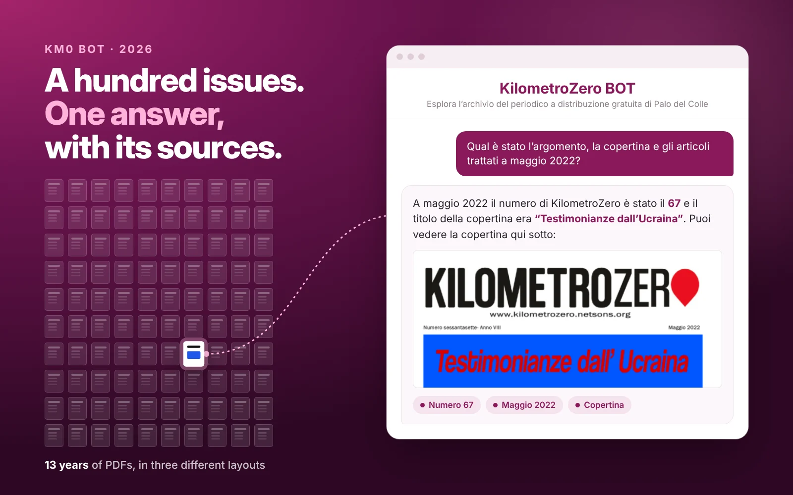
A hundred issues, one answer with its sources: a grid of a hundred newspaper issues with issue 67 highlighted and linked to the KM0 Bot window, where the bot answers a question about May 2022 with issue 67, the cover title Testimonianze dall’Ucraina (Accounts from Ukraine) and the cover itself
A real question and the bot’s answer in Italian, shortened, with the cover of the issue it cites.
The problem

Thirteen years of PDFs in three different layouts: a valuable archive, but only for people willing to leaf through a hundred issues.

How I solved it

For the 100th issue of KilometroZero I built an assistant that answers in Italian and cites the issue, page and author of every source.

  • Every answer with its sources
  • Tested on questions with known answers
  • Free, for the whole town
How I did it

The hard parts

Three layouts in thirteen years
I wrote an extraction step that recognises headlines, columns, boxes and recurring sections, so each article stays whole.
Two kinds of question
“When was the church of the Madonna di Juso built?” is about meaning; “What came out in May 2022?” asks for an exact fact. The first needs embeddings, the second needs dedicated tools.
Trust, in a small town
Answers are structured: every statement is tied to a specific article.

Three choices and their trade-offs

  • Hybrid search, not vector search alone. More parts to maintain, but numbers and dates come from the data, not from a guess.
  • Show only the sources actually cited. The list is shorter, but every link backs up a sentence in the answer.
  • A screen that guides the first question. One more step, but it helps people ask what the archive can answer.
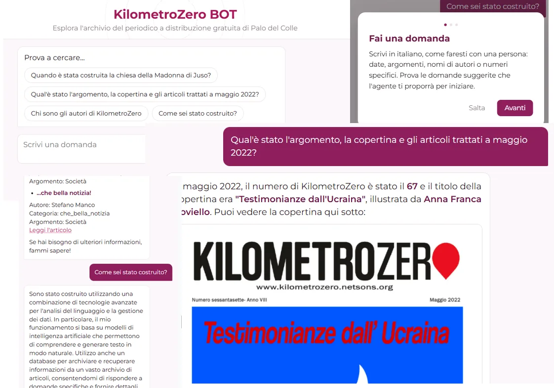
KM0 Bot screens: the welcome card inviting people to write in Italian as they would to a person, suggested questions and an answer about the May 2022 issue with its cover
The interface: guidance for the first question, suggestions and an answer.

The bot remembers the conversation and can show the cover of any issue. It is a volunteer project, built for a small newsroom and a town with a lot to tell.

Try KM0 Bot (in Italian) →
2026Lab

Learning by building, with AI

Study projects, built with AI and checked by me.

Cover of theLook Analytics: five questions from an online shop, five answers from the data

Data analysis

theLook Analytics

Five business questions about an online shop, and a data model verified by 54 tests.

BigQuery · dbt · Power BI · Tableau · Python

Open →
Cover of the study animated comic Ricerca o innovazione? (Research or innovation?)

Explaining the rules

Research or innovation?

A 13-minute animated comic, in Italian, on how research and innovation are recognised and funded.

Script and sources by me · drawings and animation with Claude

Watch it →
Cover of ring/lab: the circle that decides who serves whom

Interactive explainer

The server circle

Consistent hashing you can play with: servers, replicas, caches and hysteresis.

A technical system made explorable

Try it →
Travel Voice Translator: a sentence spoken in Italian and its Japanese translation, with the detected context and the reliability warning

Voice and languages

Travel Voice Translator

Translates speech with context in mind, and tells you when it is less sure.

With an error-analysis notebook

On Behance →
Vettore: for one keyword, your page’s score compared with the top two competing pages, and the terms to consider

Embeddings

Vettore

Compares a page’s meaning with its competitors’, and gives a weighted score and the missing terms.

Cosine similarity, shown as a comparison

On Behance →
Economix: an assistant for simulated investments. Asked what to do now, the app answers, in Italian, that the plan’s priority is to complete the base, not to add trading

Coding with AI

Economix

An assistant for simulated investments that runs locally: Streamlit, SQLite, FinBERT and RAG.

Built with Claude Code, with more than 450 automated tests

2025Outside the office

Online and offline

Scacco del Colle: chess in the square and online

In 2025 I founded a non-profit community association in Palo del Colle: chess for all ages, in the square and online.

Mosaic of faces of players of all ages at tournaments and events
Outdoor tournament in front of the Arco della Pace, tables in the square seen from above, activities at the club’s premises and living chess in costume

Offline

Tournaments in the square, living chess in costume and a team of volunteers.

The association’s YouTube channel with event videos, the illustrated story Sui passi della Regina and posters

Online

Website, YouTube, social media, a newsletter and AI-illustrated stories.

  • April to December 2025
  • 313,885views on Facebook
  • 8,500views on YouTube
  • 2,209website users

Under the patronage of the town council of Palo del Colle and the Apulian regional committee of the Italian Chess Federation.

scaccodelcolle.com (in Italian) →

2020–26Analytics and data

Measuring to decide, at Archiproducts and Edilportale

Award ceremony on stage at GA Summit 2025: Best Architecture and Design products tracking strategy, Archiproducts
GA Award 2025

Best Architecture & Design Tracking Strategy

At GA Summit 2025 in Milan, the Archiproducts tracking strategy, the work described here, won an award.

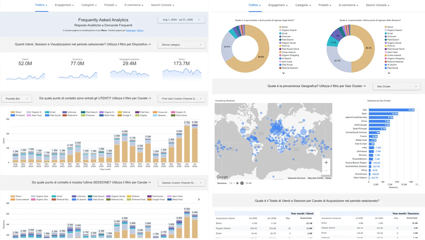
Looker Studio dashboard called Frequently Asked Analytics: panels titled as questions, with users, sessions and page views, entry channels over time, a world map and sessions by region
Frequently Asked Analytics. Every panel is a question in plain language.
The problem

Plenty of data, but few answers for the marketing and UX teams. And platforms that do not keep historical data forever.

How I solved it

I started from the questions in the measurement plan: tracking with Tag Manager and GA4, data kept since 2012, dashboards where every panel answers a question.

  • 2025 GA Award
  • since 2012 data history
  • 1,529 domains in the backlink audit
How I did it
  • Tracking. Tag Manager for UX events, advertising and new features; GA4 with funnels, key events and channels consistent with UTM tags; consent is handled by the CMP.
  • History. Python scripts save Search Console and Analytics data on the company’s servers; a move to Metabase was under way.
  • Content and search. Embeddings and cosine similarity to measure how relevant a page is compared with competitors; in 2025 a backlink audit shifted the focus from spam to opportunities.
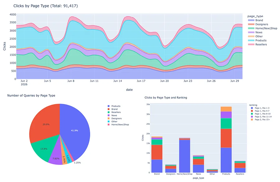
Python and Plotly charts on Search Console data: daily clicks by page type, share of queries by page type and clicks by page type and ranking band
Search Console clicks by page type, with Python and Plotly.

Three choices and their trade-offs

  • Start from the questions, not from ready-made reports. Fewer charts, but each one answers a question someone in the company actually asks.
  • Keep our own data history. The scripts need maintaining, but trends since 2012 survive when the platforms delete old data.
  • Align GA4 channels with UTM tags. Extra work up front, but campaign reports match what marketing had planned.
2020Civic participation

A civic project

FacePetition: a petition to the European Parliament, written with faces

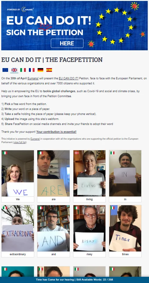
The FacePetition page: title, language flags, instructions and a grid of people holding up the words of the petition written on a sheet of paper
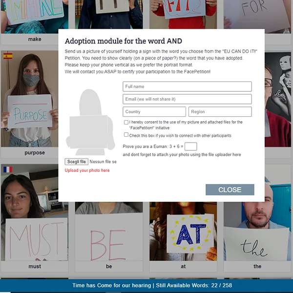
FacePetition adoption form for the word AND: name, email that is not shared, country, region, consent to the use of the photo, an optional box to get in touch with other participants, a simple sum as an anti-bot check and the photo upload
The adoption form. Consent to use the photo has a checkbox of its own.
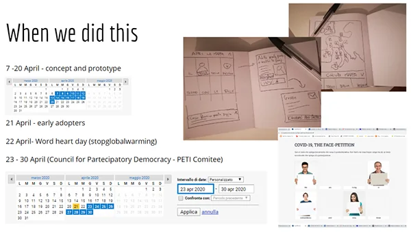
Slide with the project timeline, the paper sketches of the page and the campaign dates
From paper sketches to the page, in two weeks.
The problem

In the middle of lockdown, Eumans’ “EU Can Do It!” petition needed to reach the European Parliament with faces behind it, not just signatures.

How I solved it

Each word of the text is adopted by a person, who writes it on a sheet of paper and takes a photo. The page builds the petition face by face, in five languages.

  • 236/258 words adopted
  • 12 countries
  • < 4 weeks from the first sketch
How I did it: consent and numbers

The form asks only for what is needed: name, an email that is not shared, country and region. Consent to use the photo is an explicit checkbox; contact with other participants is a separate, optional one.

Three choices and their trade-offs

  • A photo of a handwritten word, instead of a click. Slower to collect than signatures, but there is a face behind every word.
  • Consent and contact in two separate checkboxes. One more tick, but agreeing to the use of a photo does not mean agreeing to be contacted.
  • A single format rule: hold the phone upright. That alone makes hundreds of photos taken at home read as one text.

From the sketch to the Committee on Petitions

  1. 7–20 AprilConcept, paper prototypes, page
  2. 21 AprilThe first participants
  3. 22 AprilEarth Day on social media
  4. 23–30 AprilTowards the Committee on Petitions

Words adopted outside Italy (in Italy: 184, from 15 regions)

  • France11
  • Belgium10
  • United Kingdom10
  • Spain5
  • Denmark5
  • Portugal3
  • Germany2
  • Poland2
  • Three other countries, each1
The project on Behance →
2010–20UX design

Ten years of UX for architects, engineers and designers

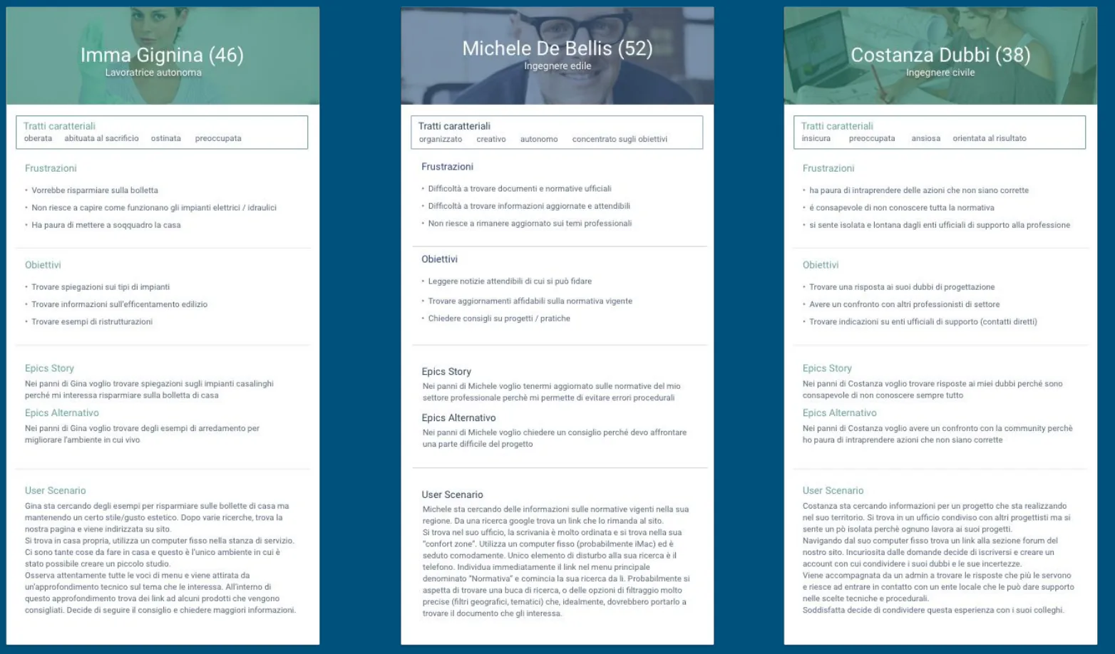
Three persona cards: a self-employed worker, a building engineer and a civil engineer, each with traits, frustrations, goals, epics and a usage scenario
Three of the personas. Michele, a building engineer, looks for up-to-date regulations he can trust; Costanza worries about acting on rules she does not fully know.
The problem

Busy professionals facing huge catalogues. And pages ranking so well on Google that no URL could change.

How I solved it

Interviews, focus groups and personas to understand who we were designing for. A/B tests on live traffic, to let users decide. And an Archiportale redesign that leaves the URLs alone.

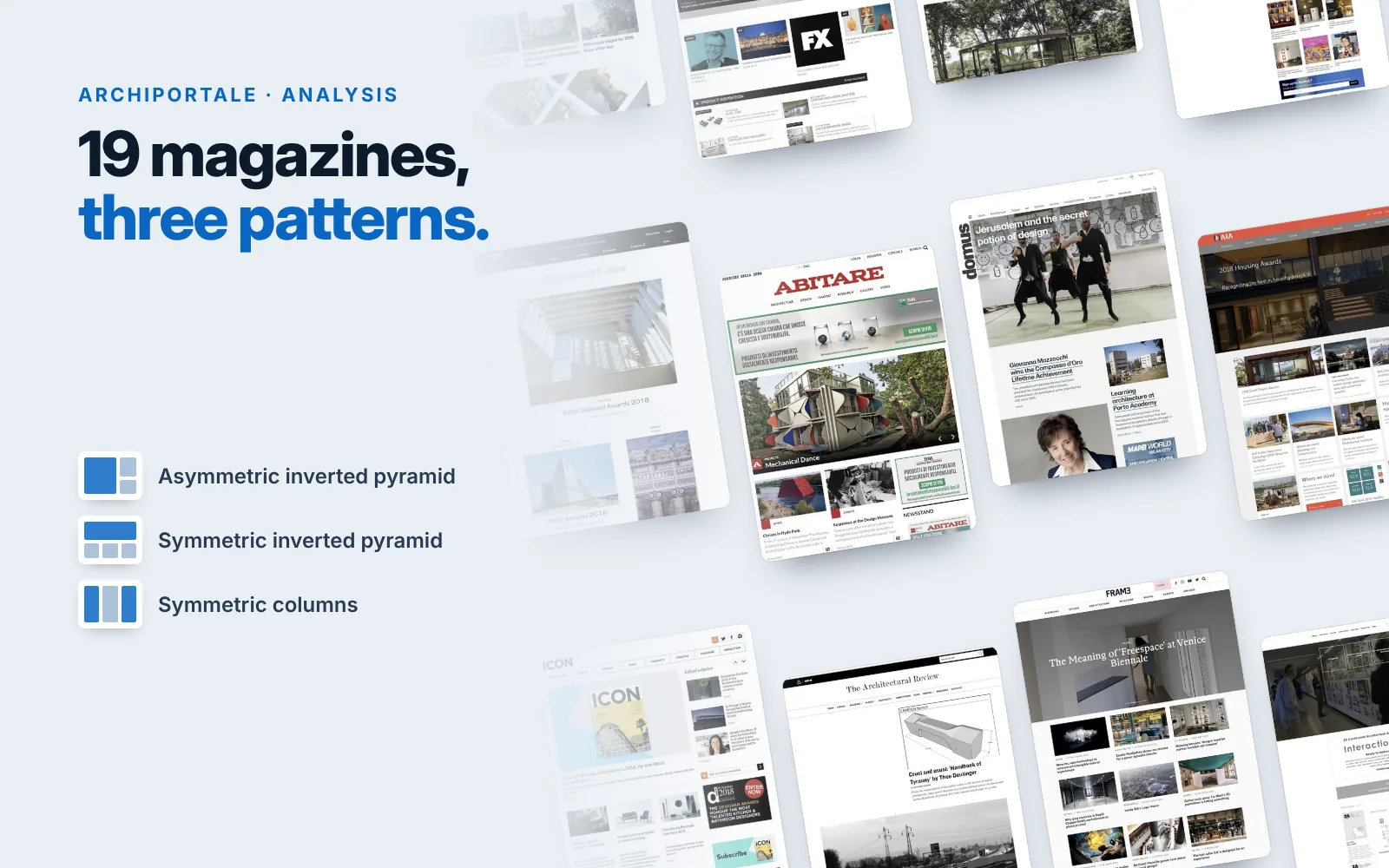
A wall of architecture magazine home pages, from Abitare to Domus to Frame, and the three layout patterns found: asymmetric inverted pyramid, symmetric inverted pyramid, symmetric columns
19 international magazines, grouped into three layout patterns.
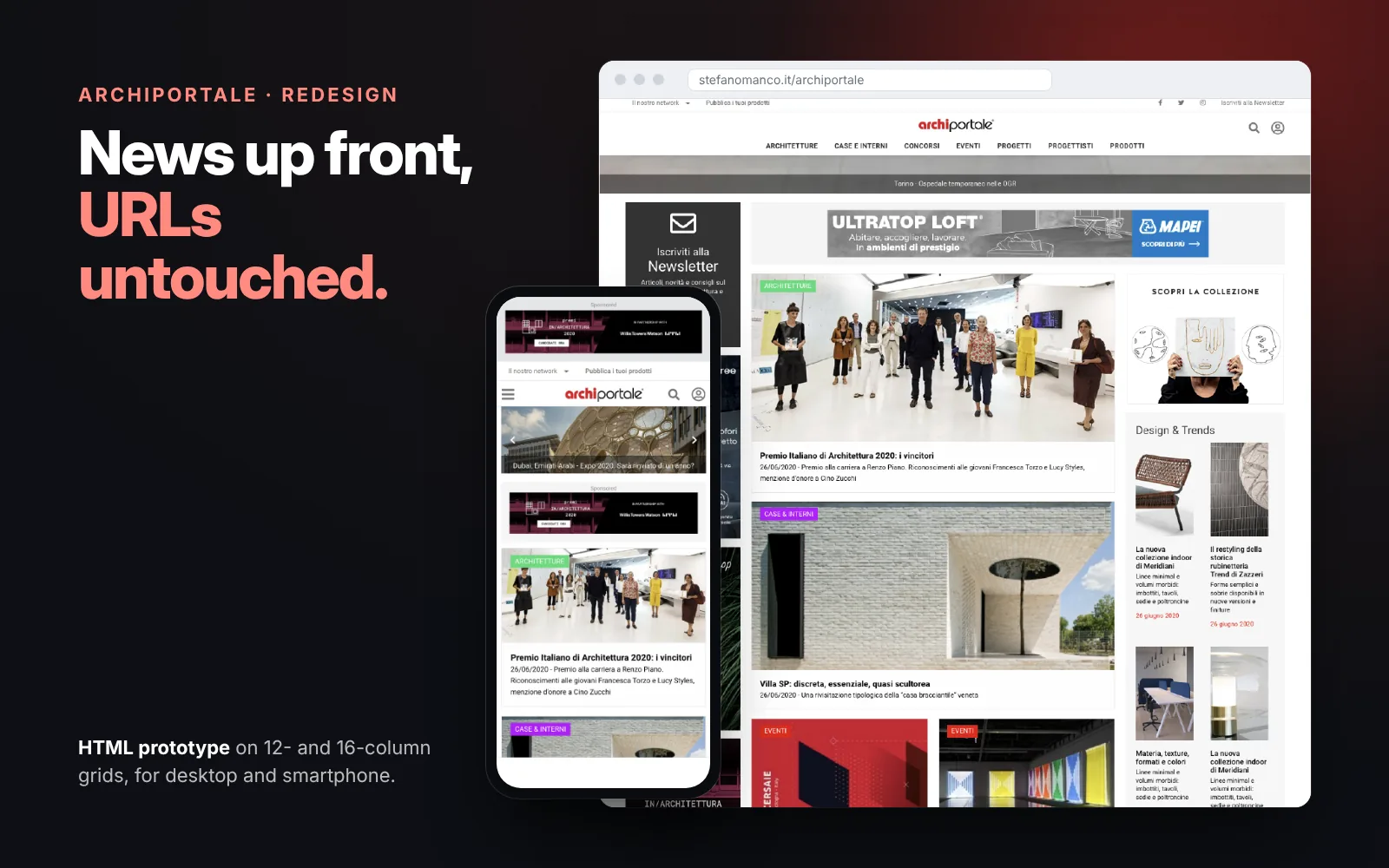
The Archiportale redesign as an HTML prototype, in a browser window and on a smartphone: news up front, ads built into the layout and newsletter sign-up
The redesign, built as an HTML prototype. See it →
  • The winning versions went live
  • 19 international magazines analysed
  • Navigation redesigned without touching the URLs
How I did it: research and tests

I worked as a UX designer alongside designers, developers and marketers. Our users read in a hurry, jumping from one paragraph to the next and stopping on strong images. A seven-stage customer journey map showed, for each stage, what we already did and what we could do.

A/B tests went live with Google Experiments, now discontinued: a switch instead of a button, two versions of the information request form, different sign-up flows. The numbers stayed with the company; the versions that worked better are the ones that stayed live.

The Archiportale brief, in one questionHow can we get construction, architecture and design professionals to read as many news stories as possible on archiportale.com, and so justify higher advertising rates?

  • Competitor analysis. 19 magazines grouped into three patterns: asymmetric inverted pyramid, symmetric inverted pyramid, symmetric columns.
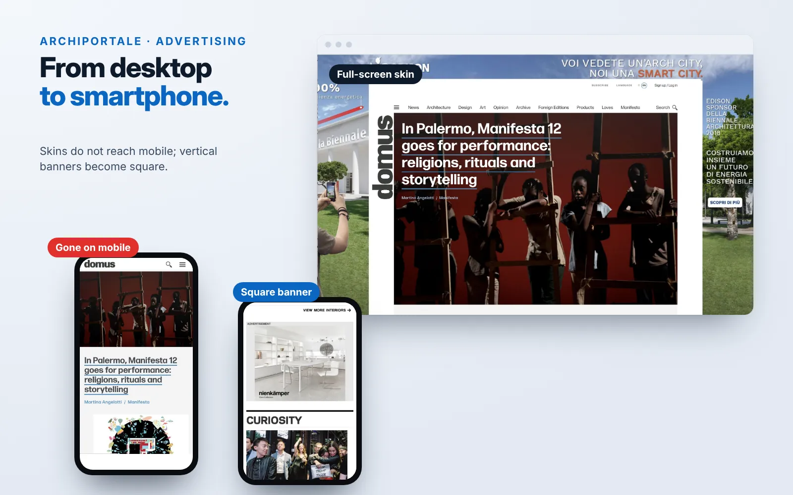
  • Advertising. On mobile, full-screen skins disappear and vertical banners become square.
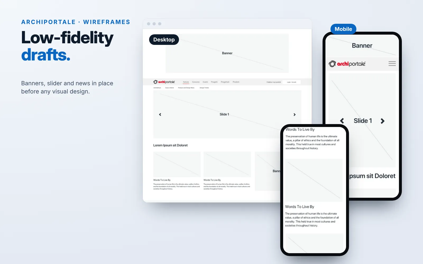
  • From wireframes to code. HTML pages on 12- and 16-column grids with Foundation 6, files versioned in TFS, and AMP under evaluation for mobile.
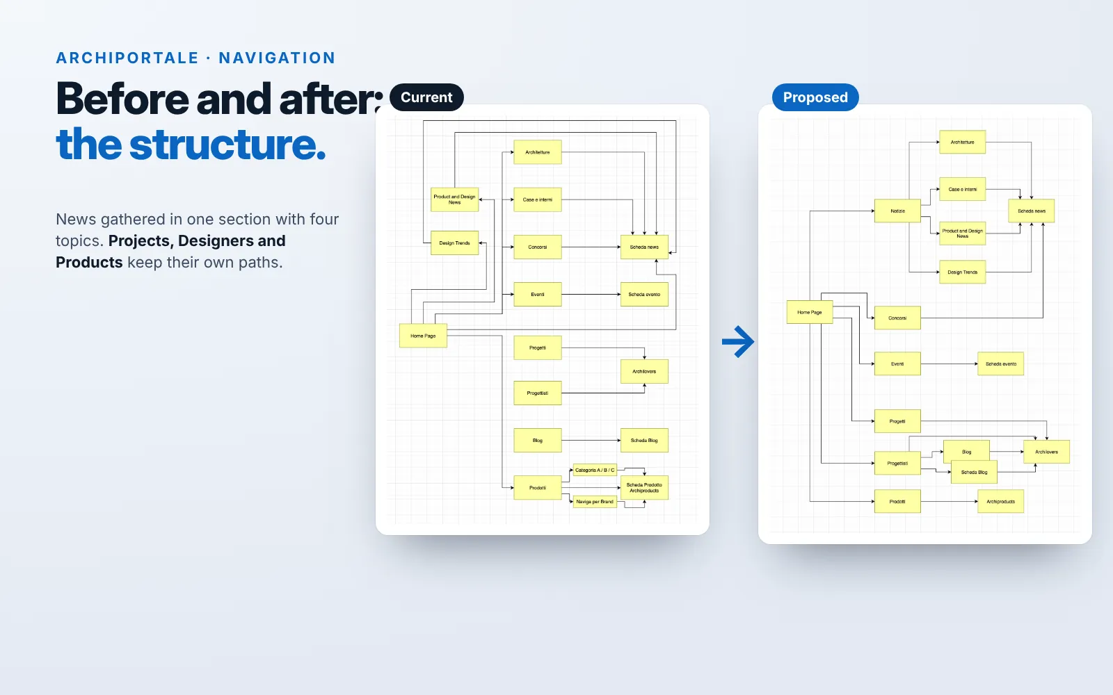
Flowcharts of the current and proposed Archiportale structure, side by side: in the proposal, news is gathered in one section with four topics
Navigation, before and after.
A full-screen advertising skin on domus in the desktop version, the same page on a smartphone without the skin, and a square banner on mobile
Advertising, from desktop to smartphone.
Low-fidelity Archiportale wireframes: the desktop home page and two mobile screens, with banners, slider and news
Wireframes, desktop and mobile.
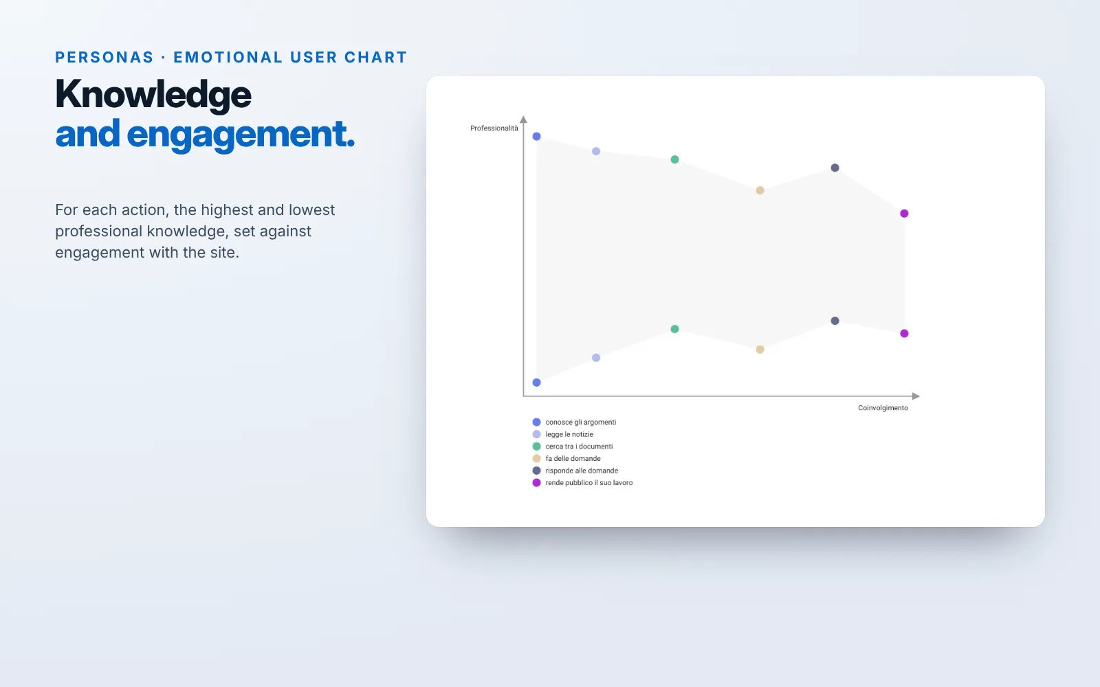
Emotional user chart: for six actions, from knowing the topics to publishing one’s own work, the highest and lowest professional knowledge against engagement with the site
The personas’ emotional user chart.

Three choices and their trade-offs

  • Keep every URL and the paths to Projects, Designers and Products. Less freedom to redesign the structure, but traffic from Google and from the rest of the network was protected.
  • Gather the news in one section, with the topics always in view. One more level, but every topic stays one click away from any page.
  • Test small changes on live traffic. Slower than one big redesign, but every change rests on what users actually did.
2019UX research

The test that saved us a development cycle

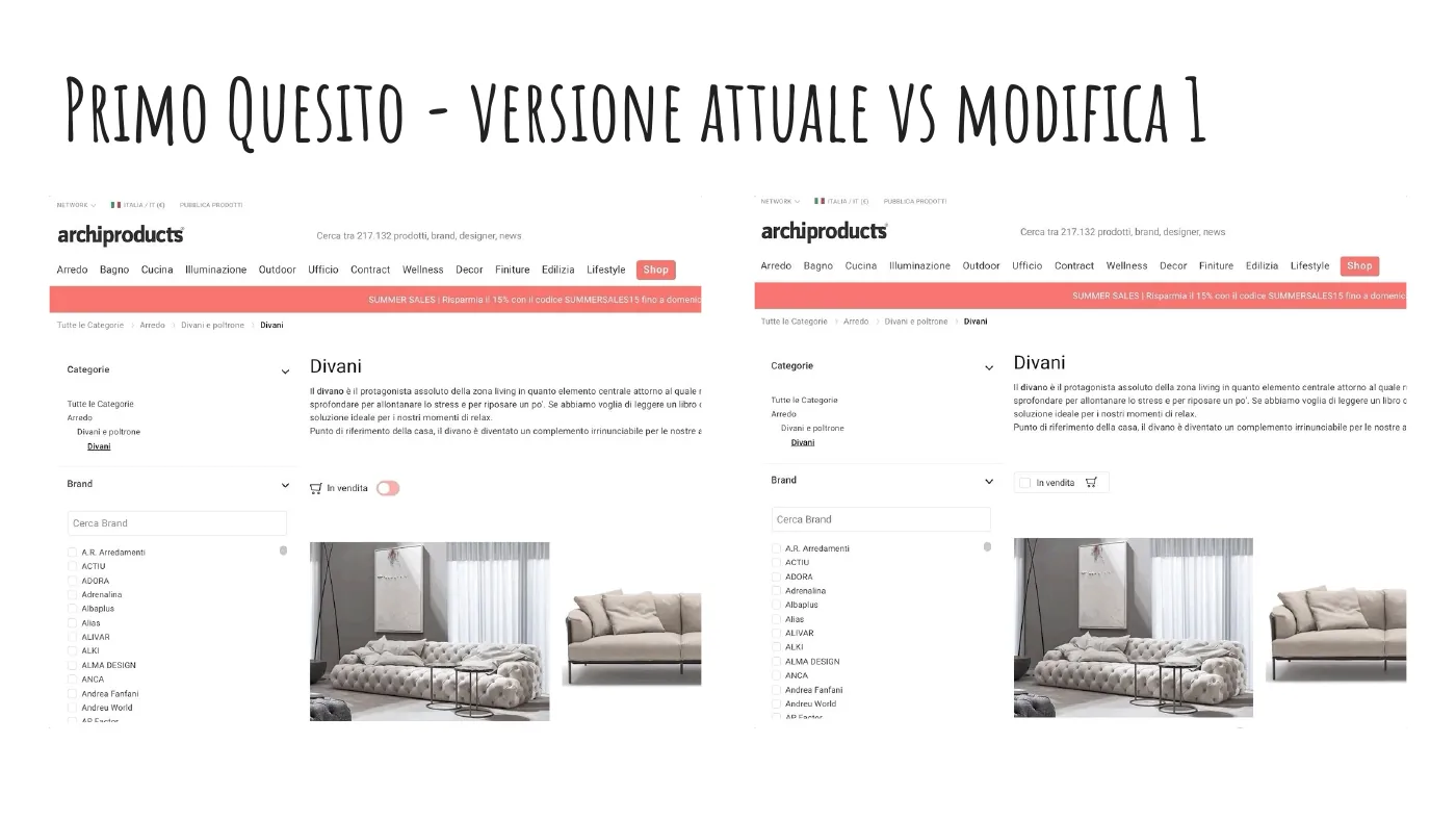
Two versions of the Archiproducts sofa catalogue: on the left the In vendita (on sale) filter as a switch, on the right the same filter as a checkbox
Current version and proposed change: a switch or a checkbox for the “on sale” filter.
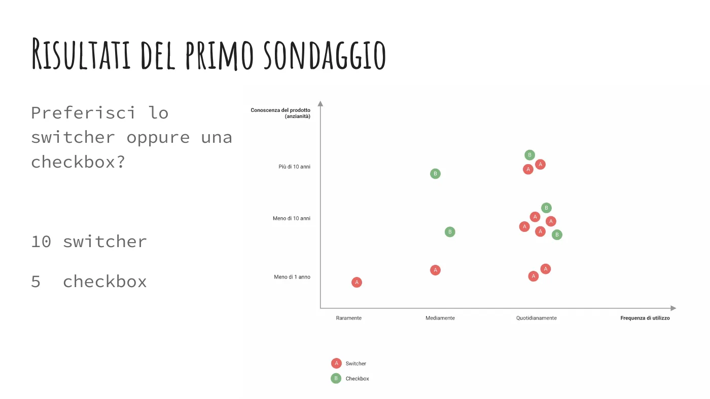
Results of the first question: the preferences of the 15 people interviewed, plotted by seniority and frequency of use, 10 for the switch and 5 for the checkbox
The results, by seniority and frequency of use.
The problem

A change to the “on sale” product filter was ready for development. But did we really need it?

How I solved it

Before writing any code, the UX team and I ran a test with 15 colleagues from 6 departments: a timed task and two comparisons between versions.

  • 29 s on average to find the products on sale
  • 10 of 15 preferred the current switch
  • Development stopped, time and resources saved
What we did instead

The answers told us to keep the switch. We made three small fixes instead: more contrast between the on and off states, a larger click area, and clearer links to the categories with products on sale.

The most useful detail came from two developers who did not know the product: one spent a long time looking for the category in the drop-down menus, the other could not find the switch and kept using the price filter.

  • The task. Find only the products on sale in the TV units category: between 14 and 56 seconds.
  • How they did it. 7 with the search engine, 4 with the drop-down menu, 1 by browsing the categories, 3 by switching approach halfway.
  • Short or long label. “In vendita” (on sale) or “Mostra solo prodotti in vendita” (show only products on sale): 8 to 7.
2019Edilportale

Edilportale 3.0: the catalogue goes responsive

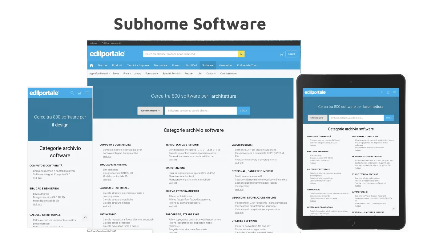
The Edilportale Software section on desktop, smartphone and tablet, with search across 800 software products and the archive categories
The problem

A catalogue built for desktop only: more than 120 requests to load a page, a single H1, no structured data.

How I solved it

In a team of six, I looked after semantic HTML, SEO and page optimisation during the move from Bootstrap to Foundation.

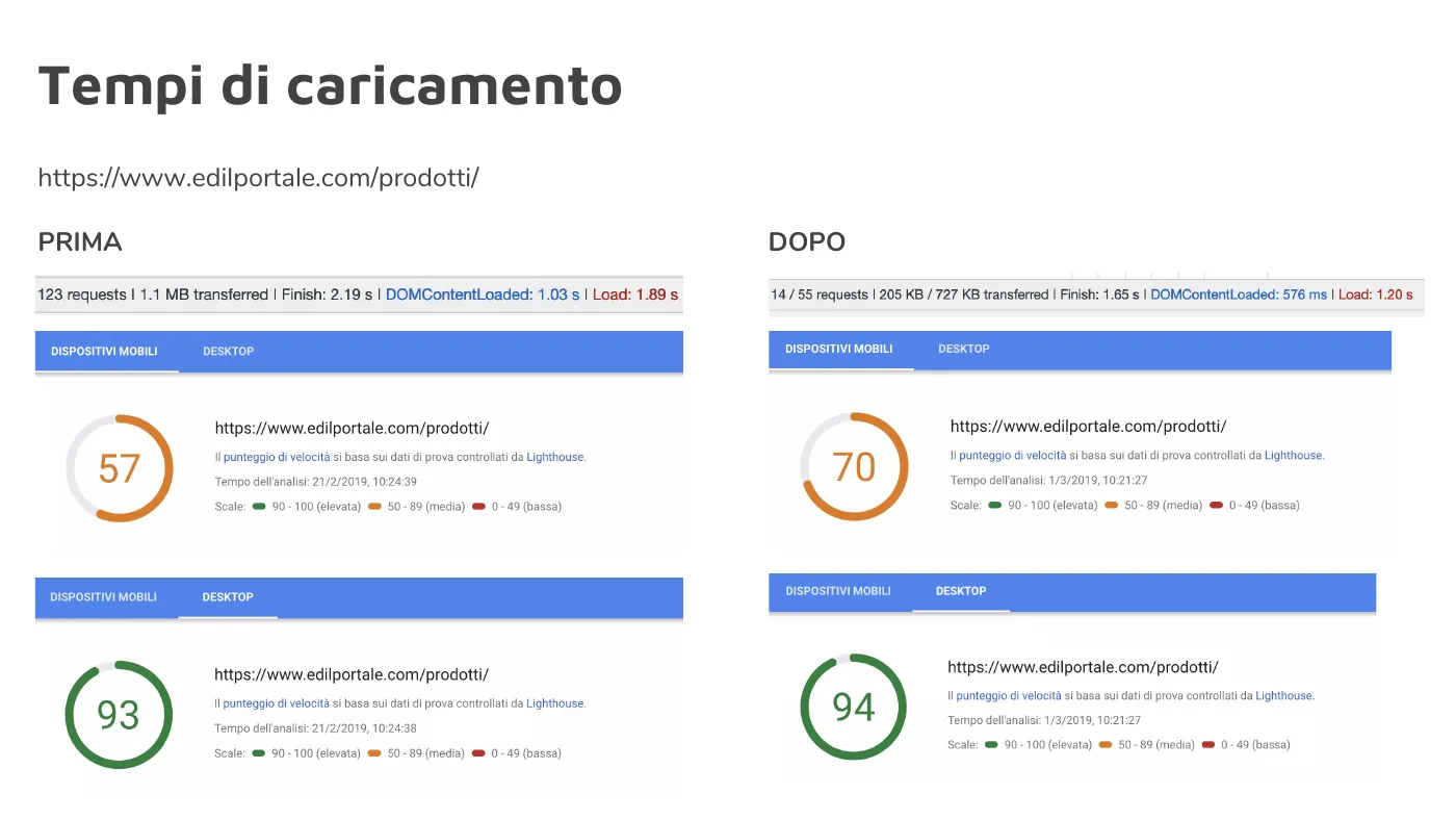
  • 57 → 70 mobile speed score
  • 123 → 55 requests
  • 1.89 → 1.20 s load time
Before and after, measured
Before and after comparison on the Edilportale products page: requests, weight and load times; Lighthouse speed score from 57 to 70 on mobile and from 93 to 94 on desktop
edilportale.com/prodotti, measured in February and March 2019.
  • Semantic HTML. Main categories are now H2s and subcategories bold text; each category has its own description, for a better text-to-code ratio.
  • Structured data. Products, brands, breadcrumbs and news described according to schema.org.
  • On a category page the mobile speed score went from 69 to 75.
2018Edilportale network

From product to order: four projects

In-depth landing page for an outdoor furniture collection

Edilportale

One page for a single product

In-depth landing pages for desktop and mobile, designed in Sketch.

On Behance →
Chapters of the ArchiSeller flows document: platform, single purchase with delivery, ArchiSeller shipping, multiple purchases

Marketplace

ArchiSeller: the purchase flows

Every combination of delivery, availability and payment written out step by step.

6 actors · 3 payment methods · 5 order states

The exceptions planned for retailer pages: text centred when there is no gallery, gallery centred when there is no description

Archiproducts

Retailer pages

Two layouts compared and a rule for every empty case: no description, no gallery, or neither.

Wireframes of the network’s Shop, News, Focus and Notizie newsletters

Newsletters

From hand-built to templates

Every newsletter in the network analysed, and a template-based composer instead of HTML written by hand each time.

Scroll sideways to see them all →

2016Archiproducts

Salone del Mobile, on desktop and in your pocket

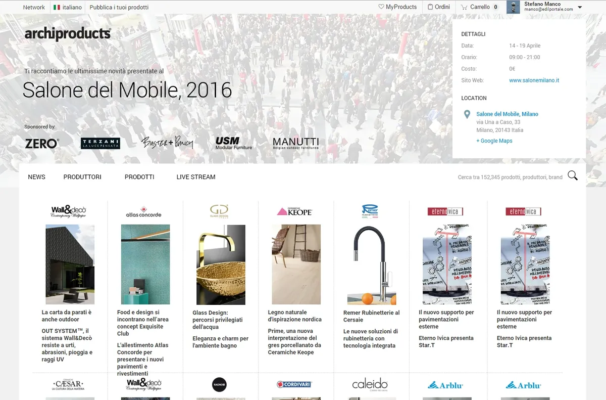
Archiproducts page for Salone del Mobile 2016 with featured products, desktop version
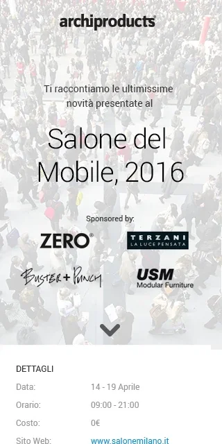
The Salone del Mobile 2016 page in its mobile version

Archiproducts coverage of Salone del Mobile 2016. On Behance →

2015Archiproducts

The Archiproducts restyle, starting from what others do

The problem

A sign-up that asked for your location first and confirmed your email twice. A product page with too many calls to action.

How I solved it

I analysed 8 sign-up flows and 7 product pages, then tried our content in their layouts.

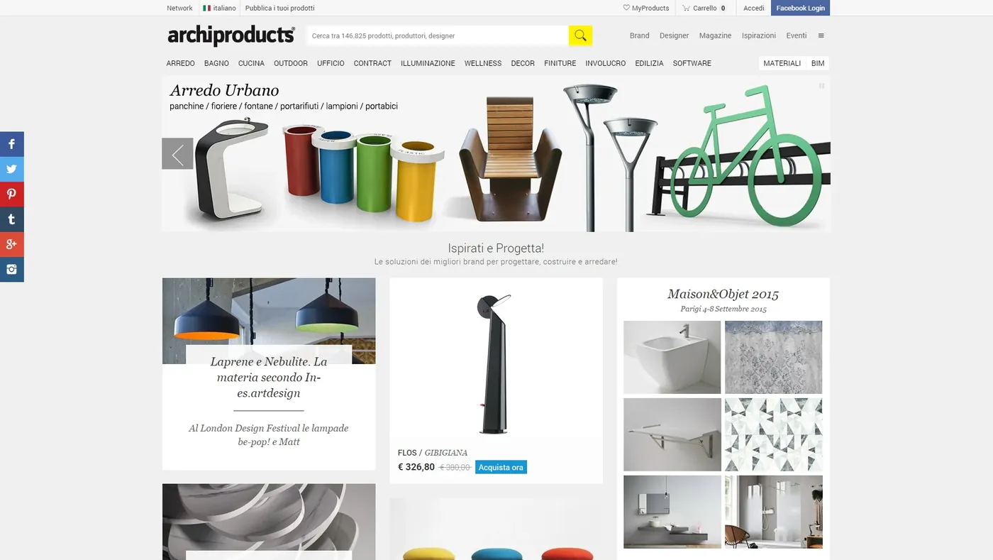
Archiproducts home page after the 2015 restyle, with products and news
The home page after the restyle.
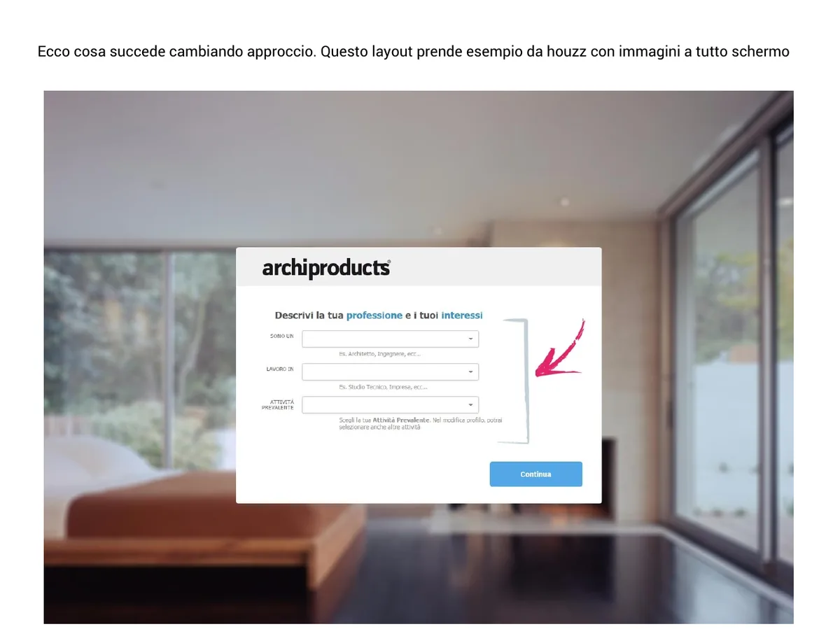
Proposed step-by-step sign-up on Archiproducts, with a full-screen photo and profiling in a wizard
Step-by-step sign-up, with profiling in a wizard.
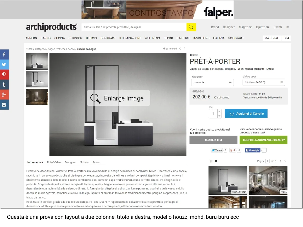
Trial two-column Archiproducts product page, with the title on the right and the purchase box in view
A product page trial in two columns.
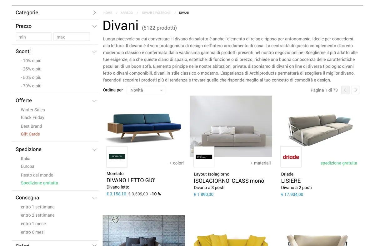
Sofa catalogue page on Archiproducts, with side filters and a product grid
The catalogue, with side filters.

The restyle on Behance →

2014Edilportale

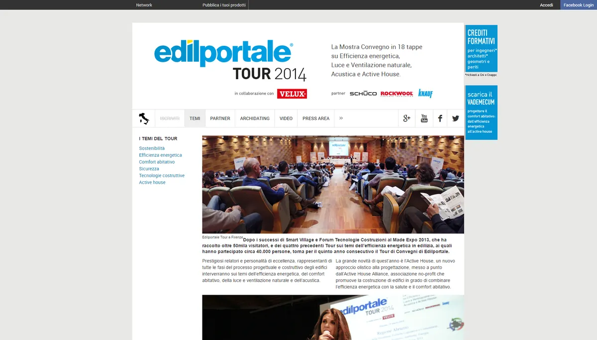
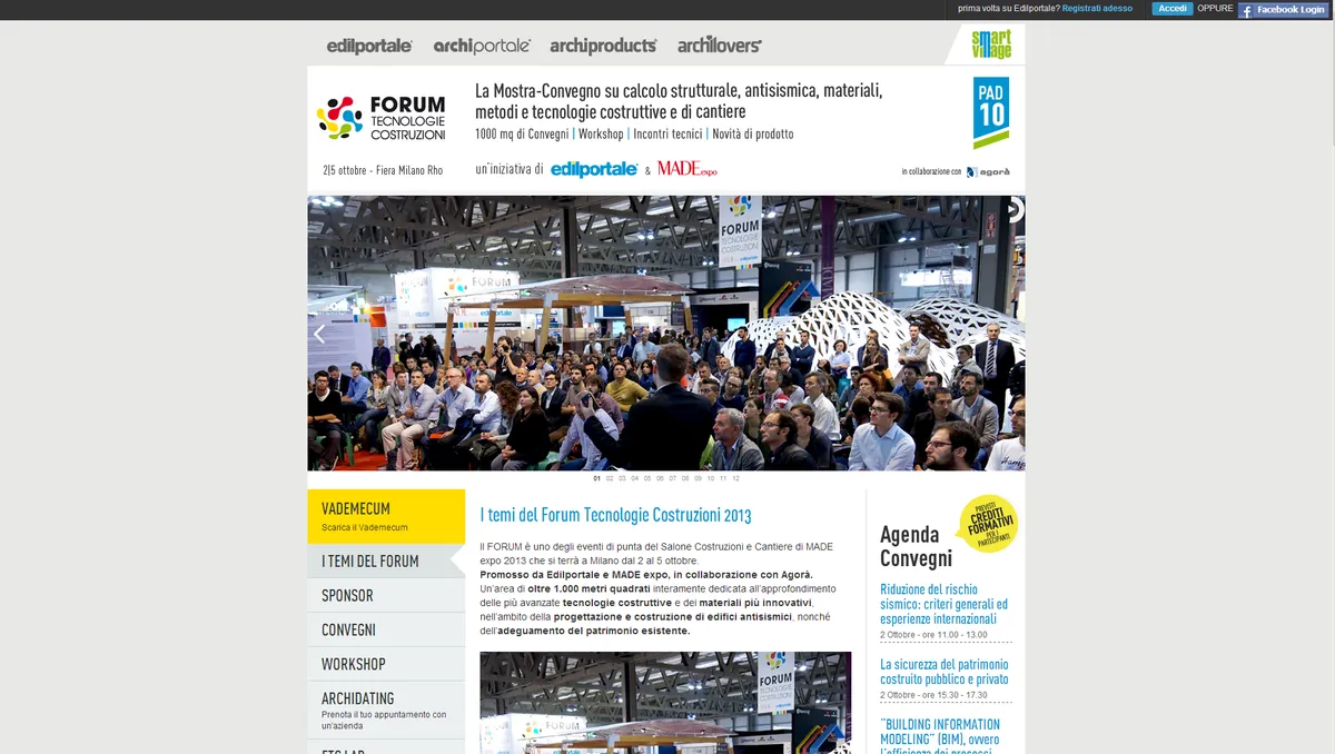
Edilportale Tour: a touring exhibition and conference in 18 stops

Edilportale Tour 2014 home page: the exhibition and conference in 18 stops, with a photo of a packed hall Forum Tecnologie Costruzioni page, with the conference hall, the topics and the agenda

The site of Edilportale’s national tour and the pages of its events. On Behance →

2011Edilportale

Components built in-house

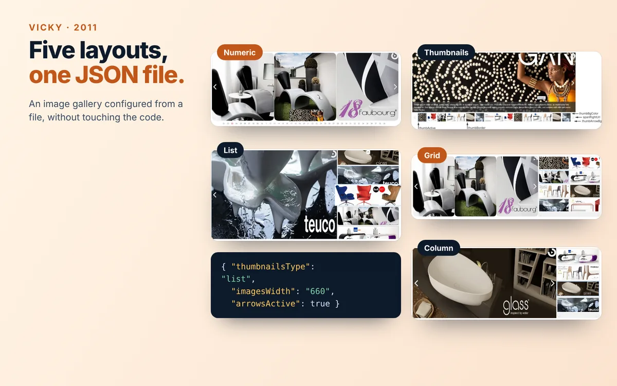
Vicky: the five gallery layouts (numeric, thumbnails, list, grid, column) with a snippet of the JSON configuration file
Vicky · 2011. Image galleries in five layouts, configured from a JSON file.
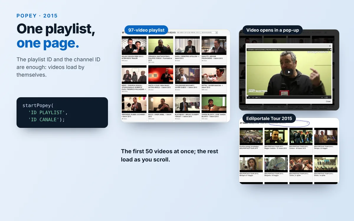
Popey: a 97-video playlist as a grid, a video opened in a pop-up, the Edilportale Tour 2015 playlist and the line of code that starts the component
Popey · 2015. A YouTube playlist turned into a page with a few lines of code.
2009YOOX · Bologna

Telling the story of fashion, not just selling it

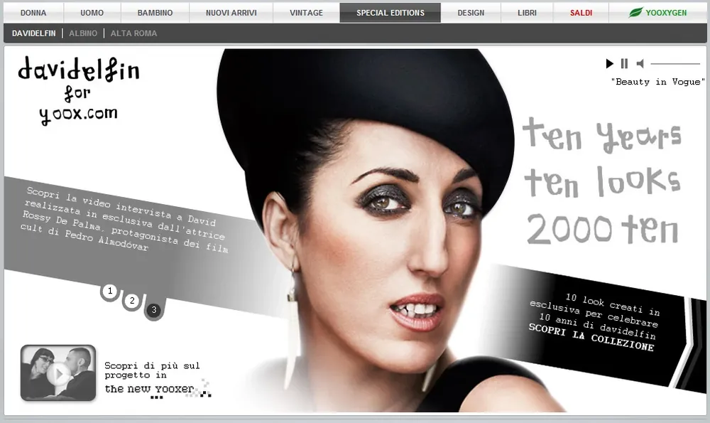
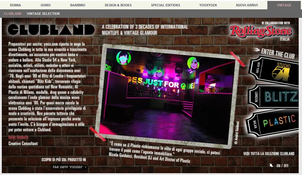
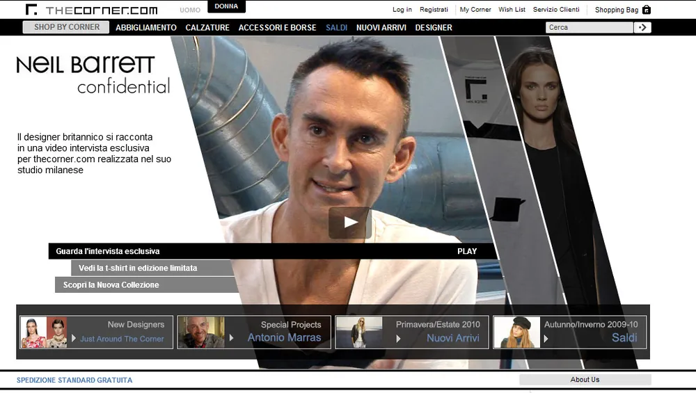
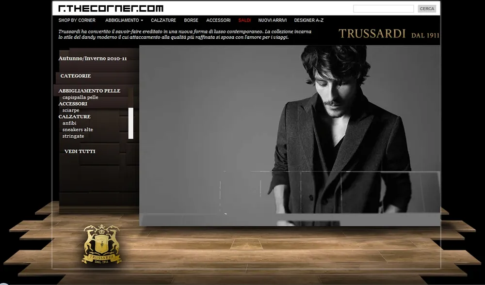
Special pages for yoox.com and thecorner.com in ActionScript, for brands such as Valentino, Armani and Moschino.

davidelfin special page for yoox.com: ten years, ten looks Clubland special page on yoox.com: three decades of clubs and vintage glamour, with Rolling Stone Italia Neil Barrett Confidential page on thecorner.com, with a video interview Trussardi special page on thecorner.com

MyYoox Experience · Special Projects

2004Where I started

Communication, photography, design

Bari, 2001–2004. Communication Sciences, with a thesis on the history of photojournalism.
2004–2006. Photographer and team manager for tourist resorts, in Italy and abroad.
Copenhagen, 2006–2008. Multimedia Design (AP Degree): UX, interaction design and digital communication.

All projects on Behance →

Shall we talk?

If any of these problems sounds like one your team is facing, let’s set up an introductory meeting: I’ll walk you through how I worked on it and what I would do differently today.